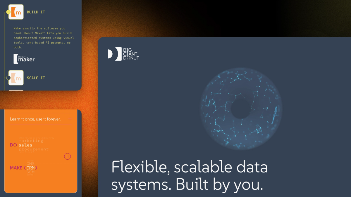
A software company that makes low-code tools for building business systems on data you own.
Role: Development, animation, technical strategy
Client: Big Giant Donut
Stack: Astro, Sanity, Netlify, Mailchimp, Airtable
What Big Giant Donut Needed
Big Giant Donut acquired Helix, a database builder that has run real businesses since 1984, and rebuilt it as a new product called Donut Maker. JTB Imaginative led the brand, the strategy, and the site mockups. I turned those mockups into the working site.
The old Squarespace site was about Helix. The company needed a new one that announced Donut Maker, signed up beta testers, and still looked after the long-time Helix users who depend on the old pages.
It also had to be the first phase of something bigger. A multi-page site comes next, then documentation and a store. The team needed a site they could run themselves now, without rebuilding it later.
What I Built
The mockups, brought to life. Sections rise into view as you scroll, and the layout scales smoothly from a phone to a wide screen instead of jumping between fixed sizes. It works with a keyboard and a screen reader, and visitors who prefer less motion get a calmer version. The donut at the top is a transparent video, so it sits exactly on the page color.
A site the team edits, and sees before it goes live. Every section of the page is a block the team can reorder and edit in Sanity. A live preview shows changes, drafts included, before anyone publishes.
Room to grow, from day one. I built it on Astro and Sanity, with the content and page sections planned for the next two phases, so new pages get added instead of rebuilt.
Beta signups that sort themselves. Joining the beta takes a name and email first, then a longer application on its own page. Signups go to the company's mailing list, and applications land in Airtable for review, with spam screened out first.
Nobody gets left behind. The old Helix pages moved to their own address, and old links redirect there, so Helix users still find their downloads and archive.
How It Turned Out
The new site went live on October 5, 2026, replacing Squarespace. The team runs it from Sanity, and beta applications arrive ready to review.
On October 10, Lighthouse scored the homepage 94 for performance and 100 for accessibility, best practices, and SEO on a phone, and 100 across the board on desktop.
I'm their developer for the next phases: the multi-page site, then documentation and the store.
Building Something Like This?
Tell me about it. I reply within 48 hours.